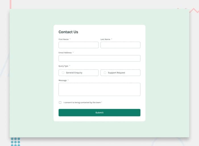
Contact form
Building accessible forms is a crucial task for front-end developers. This challenge will help you practice building a form with several input types and validation.
📝 Brief
Your challenge is to build out this contact form and make it look as close to the design as possible. Pay particular attention to making this form accessible. Building accessible forms is a key skill for front-end developers, so this is a perfect challenge to practice. You can use any tools you like to help you complete the challenge. So, if you have something you'd like to practice, feel free to give it a go.
Your users should be able to:
- Complete the form and see a success toast message upon successful submission
- Receive form validation messages if: 1. A required field has been missed 2. The email address is not formatted correctly
- Complete the form only using their keyboard
- View the optimal layout for the interface depending on their device's screen size
- See hover and focus states for all interactive elements on the page
💡 Ideas to test yourself
1. Pay close attention to making this form accessible and run manual and automated accessibility tests
2. Ensure the error messages and success toast message are announced to screen readers
Solution retrospective
What are you most proud of, and what would you do differently next time?
I’m most proud of successfully implementing form validation using only HTML and CSS, without relying on JavaScript. It was a challenge to ensure the error messages only appear after the user submits the form, but I managed to achieve this using :invalid selectors creatively. Additionally, making the radio button selection visually clear with CSS enhancements was a great learning experience. Next time, I would focus more on browser compatibility to ensure the validation styles work consistently across different devices. I would also explore ARIA attributes to improve accessibility and make the error messages more user-friendly for screen readers. If JavaScript were allowed, I might add more interactive validation feedback to enhance the user experience.
What challenges did you encounter, and how did you overcome them?
One of the main challenges I faced was ensuring that the error messages only appeared after the user clicked the submit button, rather than showing them by default. Since I was using only HTML and CSS for validation, I had to carefully structure my CSS selectors. I overcame this by using the :invalid pseudo-class effectively and ensuring that error messages were hidden initially but displayed when necessary. Another challenge was handling radio button validation because the error message needed to appear outside the .radio-box, making sibling selectors (~) ineffective. I resolved this by rethinking the structure of my HTML and styling the closest possible container using CSS. Additionally, making the form fully responsive using CSS Flexbox required careful adjustments, but through testing and tweaking, I managed to ensure a smooth layout on different screen sizes.
What specific areas of your project would you like help with?
I would love feedback on the form validation approach using only HTML and CSS. Specifically, I’d like to know if there are better ways to structure the form and selectors to improve accessibility and maintainability. Additionally, I faced some challenges with radio button validation since the error message needed to be placed outside the .radio-box. I’d appreciate suggestions on handling this scenario more efficiently using just CSS. Lastly, any feedback on improving responsiveness and making the UI more polished, especially for smaller screens, would be really helpful!